
Work
Reclamación Wines
Brand Identity · Creative Direction
A bottle that carries the story before a single word is read.
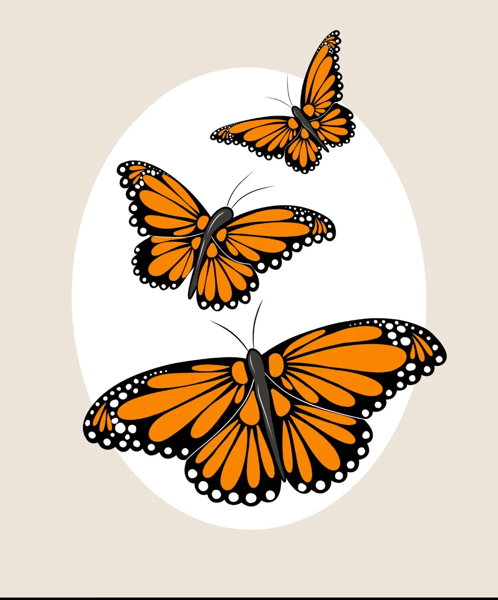
Illustration by Alyssa Arreola — Illustrator · Xochitl Studios
The brief
A Mexican-owned wine brand built on a symbol of migration and resilience.
Reclamación is more than a wine label — it's an act of reclamation. The bottle design centers the monarch butterfly, a symbol tied to migration and resilience for DACA recipients and Latino migrants in the US. The creative direction had to honor that weight without turning the brand into a lecture.
Creative direction
The symbol does the heavy lifting. Everything else gets out of the way.
The monarch butterfly migrates across borders every year. So do the people this brand is built for. The design leans into that parallel — not as metaphor, but as identity. The bottle isn't branded. It's declared.
The outcome
A brand that knows exactly who it belongs to.
Brand identity and creative direction for Reclamación Wines.
Next
← Back to work